Author: neelam

Neelam Interiors / Articles posted by neelam (Page 10)

Back to School: Rental Style

The mornings are crisp, the glorious sun takes a little longer gracing us with it’s light and I’m dreaming of pumpkin, that can only mean one thing … its nearly September and back to school time!  I have always loved this time of year, as a child it meant seeing friends I hadn’t seen over the summer, new clothes and school supplies, and getting to organize my desk or locker (yes, that’s right – the thought of organizing made me loose sleep) and as an adult, there’s a real sense of new beginnings and fresh starts, even more so than January.

This time of year can also mean relocating for a lot of people – moving into new apartments or dorm rooms in preparation for school, practicums, residency’s etc.  So I’ve pulled together some tips and tricks to making your new home truly yours for as long as you’re going to be there, in ways that aren’t going to upset your landlord or floor coordinator.

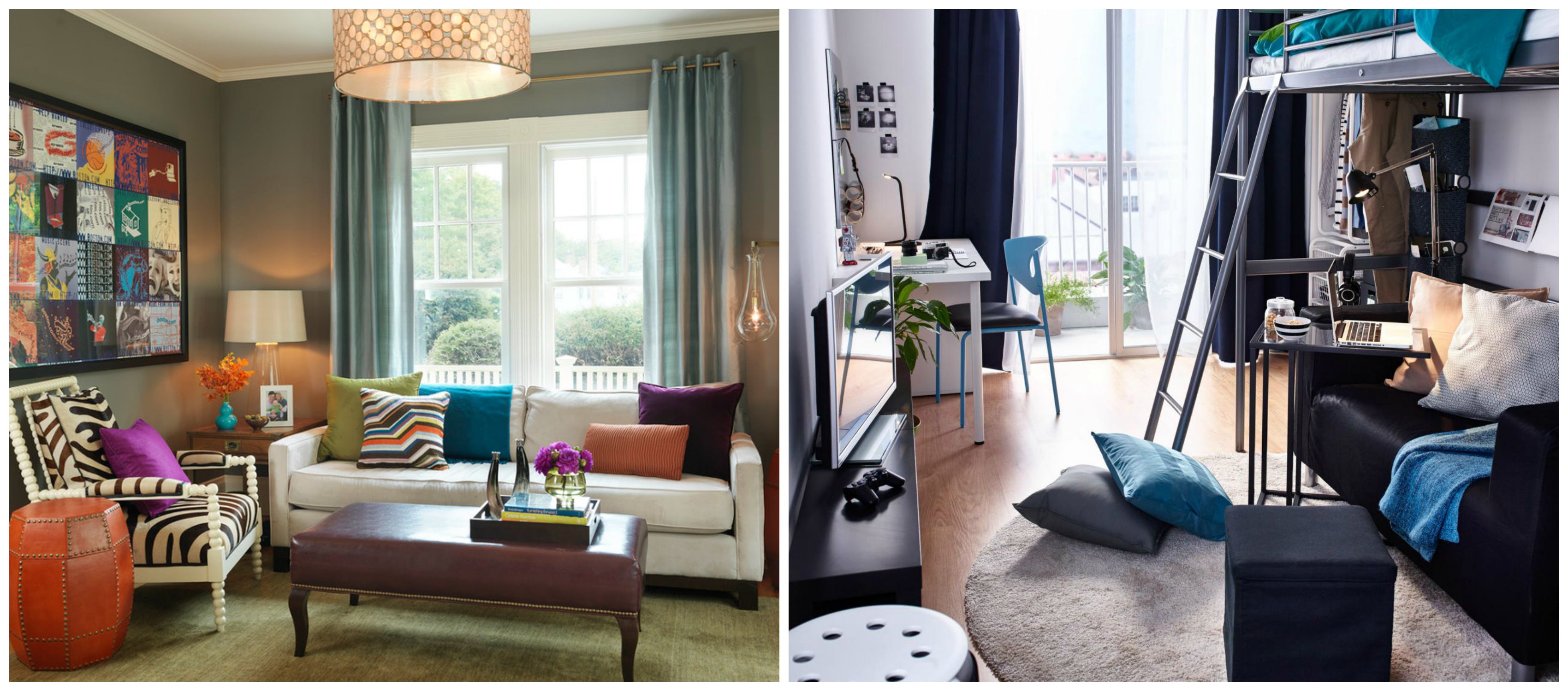
Often times when renting a space, the inclination is to hold off on buying ‘real’ furniture until you get to your ‘forever’ home.  I say invest in key pieces, especially those that could be re-purposed – a smaller dinning table could be used as a desk in a larger space, a compact sofa could fit into a den in another home.  Investing in quality furniture now will help to create a space that feels comfortable and like a home.  Think about multi-functional furniture, for instance in a dorm room a futon can be a sofa by day and a comfy bed by night.
PicMonkey Collage69(PC: Modern Family Expo and Ikea)

Don’t be limited by existing configurations of furniture in a dorm room, feel free to move pieces around to find a set up that works best for you and your needs.  For instance setting up your bed as a daybed offers seating options for when friends stop by and putting the dresser in the closet can open up a space.

The Perfect Bedroom

IMG_3855

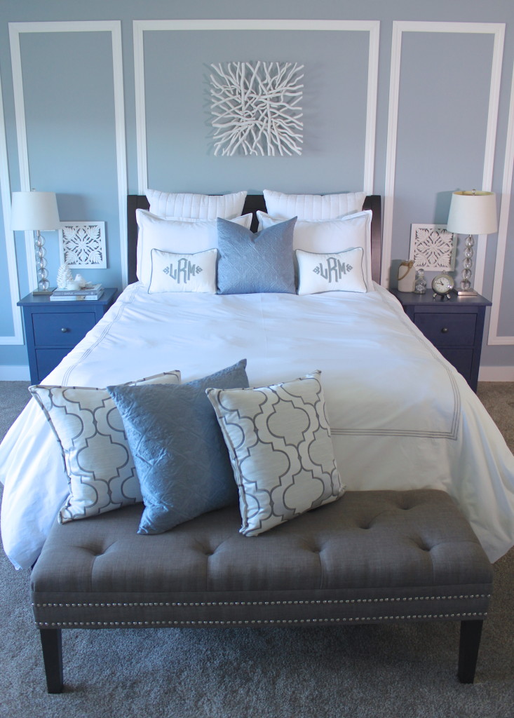
I love decorating bedrooms, in particular master bedrooms.  Let’s face it, they are the most important rooms in our homes – it’s where you start and end your day, curl up with a book, and connect with your partner.  The state of your space can profoundly affect your mood and how well you drift off to sleep and how you rise to face the day.

Unfortunately bedrooms are often the most forgotten, passed over rooms!  It’s often thought – since no one is going to see it, why bother!  Why bother?  Because you deserve a beautiful, relaxing space to wind down and start the day in!  I’m reminded of that IKEA commercial, where the homeowners intentionally keep their bedroom doors open while entertaining to show off their spectacular space.  We should all have a space we’re that proud of.

When I get to do a bedroom for a client, I love creating a truly special, sanctuary like space.  This can be achieved while still keeping the space fun, with injections of your personality and story.  There are however some rules I like to follow.

Gallery Walls

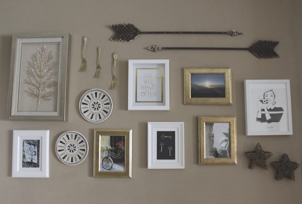
There are so many aspects of design and decor I love, but a definite front runner is creating Gallery Walls.  I love curating a variety of artwork, diverse frames, and whatever else peaks my interest in unique and creative ways.

IMG_4259

Most of the time I have a jumping off point, something that has inspired me – my muse if you will.  And then the story develops from there – I like to think of my walls as story tellers – the love of travel, good food, family, connection, colour, creativity, etc.

Bring the Indoors Out

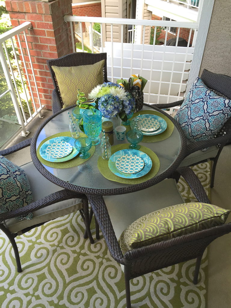
As the days get longer and the temps warmer, it’s time to expand our living spaces into the outdoors!  Bringing the indoors out and creating a space your family and friends won’t want to leave can be easy and fun with a few simple strategies.

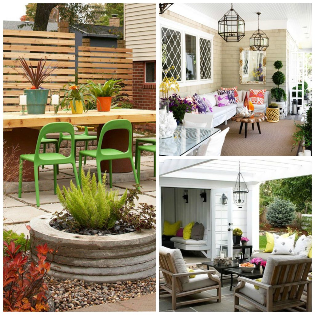
When pulling together an outdoor space first consider what you’ll most be doing in the space – lounging around, eating meals, preparing food, entertaining, etc.  Or maybe you’d like to accommodate multiple functions. Giving some thought to how you’d like to use your outdoor space will help you establish the type of furniture you’ll need – for example casual sofas or a table with chairs or both.

PicMonkey Collage54(PC: Better Home and Traditional Home)

Next consider the Color scheme.  Since today more than ever outdoor living spaces are considered an extension of our homes, I like to use a palate and style that is cohesive with that of the indoor living space – maybe pick up on some accent colors and play them up, as I’ve done.

IMG_1347

Spring Has Sprung!

Well it may not be official and those of us who have lived in Calgary for any amount of time know that it can snow in an instant – but for now, it sure looks and feels like Spring has Sprung!  And I couldn’t be happier!  Spring time brings longer days, more sunlight, a sense of renewal and most exciting for me, gorgeous, fresh flowers!

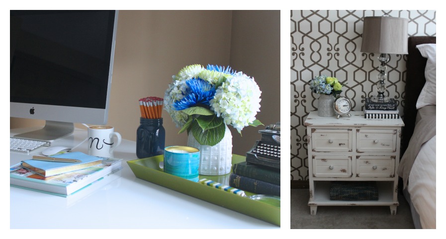
I love incorporating fresh flowers into the spaces I create.  Bed side tables and an office desk are two obvious spaces to accent with fresh flowers.

PicMonkey Collage36

But how about a pop of colour and freshness in the mudroom or laundry room?  What a wonderful surprise as you walk through the door!  And how much prettier and joyful would laundry be!

Metallics are Never a Bad Idea

Living-Room-Makeover

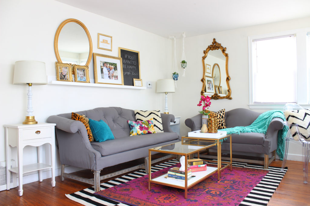
I am ga-ga for metallics!  And lucky for me they’re everywhere!

The value of warm metals like Gold, Bronze and Brass throughout history is undeniable, but until recently home decor was dominated by silvers and grays.  Only in the last little while are we seeing a revival of these beautiful metallics and I couldn’t be happier.

Office Makeover

IMG_2743

This home office went from dark and dreary to light, bright, cozy and inviting – of clients and ideas!

It is now an oasis of creativity and inspiration.

The striped wall is a key element of the space.  Click here to discover how easy it is to do yourself.

Transforming a space doesn’t always require a hefty budget – with some smart DIYs you can afford to invest in special pieces that add impact, practically and reflect your personal style.  The shelves in this office were easily painted out in white and blue to reflect the theme of the room and save money!  Click here to learn how you can accomplish something similar.

Nursery Interior Design Auburn Bay Calgary

Master Bedroom

PicMonkey Collage27

This transformation has to be one of my all time favorites.  This Master Bedroom went from dark and dreary to light and glamorous.

Not every transformation requires an entire overhaul.  In this space, I kept a lot – the headboard, bedding, and mirror – and just added a few extra elements to help achieve the look.

Guest Bedroom Interior Design Evanston Calgary

Ahh the Desk!

This is definitely my favorite part of the office, it’s also where I spend most of my time, so it ought to be my favorite!

I feel like this little corner is the perfect reflection of who I am – a lover of simple, clean design, with a splash of pretty and feminine, and a gentle nod to the past and my heritage.  Although not Indian per-say, I absolutely LOVE the hanging lanterns, they’re totally unexpected, whimsical and remind me of the far east.

IMG_3079

Seeing Stripes

IMG_2743

One of the easiest and most inexpensive ways to add interest to a space is by the addition of stripes to the walls!  Although painting out all four walls of a room in stripes is a significant commitment and much more dramatic, it can be great fun and create a one of a kind room, like this great space from www.yellowsubstudio.com.

Stripes-Wall-Inspiration1

I decided to stick to one wall … for now 😉  My inspiration for the stripes came from wanting to brighten up my office without having to paint out the entire room and cover up some patched holes.