7 Common Interior Design Mistakes
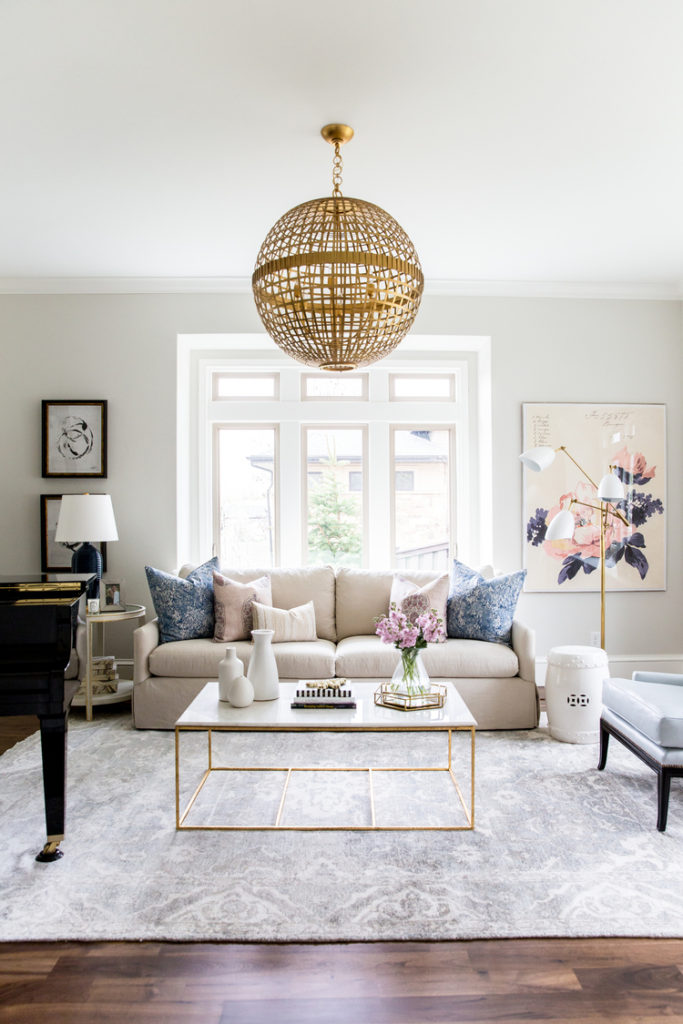
As my client base has grown, I’ve noticed a few common missteps that keep a space from feeling cohesive and well put together. Thankfully with a few simple tweaks, most of these common interior design mistakes can be easily remedied. Have a read and then take a lot around your space, have you unknowingly committed any of these? What tweaks are you going to make to achieve a polished designer look?
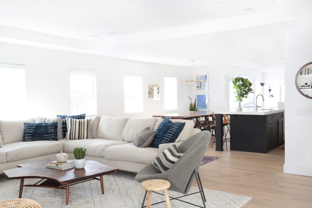
Scale
Scale is probably one of the most common mistakes when it comes to interior design. Likely because scale can be a tricky thing to figure out – too many small things in a room and it appears cluttered; too many large, bulky items in one room and it’ll feel stuffed and small.
The secret to proper scale is a mixture of different shapes, heights and sizes – you never want everything in a room to be the same height or size.
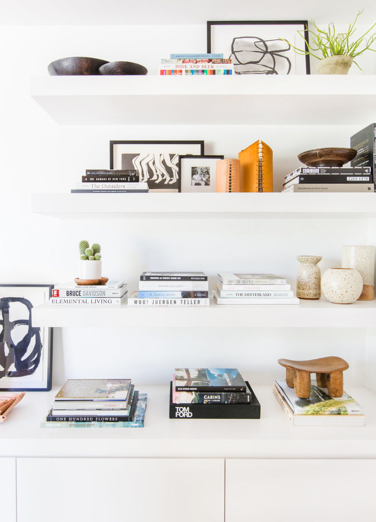
Clutter
I subscribe to the less is more credo when it comes to decorating. Invest in a few quality accessories, keeping in mind the story you’re telling in the space and how you want the space to feel. For example vintage books paired with a beautiful lamp in a reading nook; hand-blown glass vases from your travels paired with a few of your favorite design books on the coffee table.
We all tend to collect things over times, instead of displaying them throughout your home, group them together and display them in one area. This helps to create a cohesive look and keeps your space from feeling cluttered.
I love figuring out ways to incorporate hand me downs into clients home in a modern and functional way. It’s one of my absolute favorite ways to add character and charm to space. But if a piece doesn’t bring you joy – let it go! There is no use hanging onto to a piece just for the sake of it. Gift it or sell it to someone who will appreciate it and proudly display it in their home.
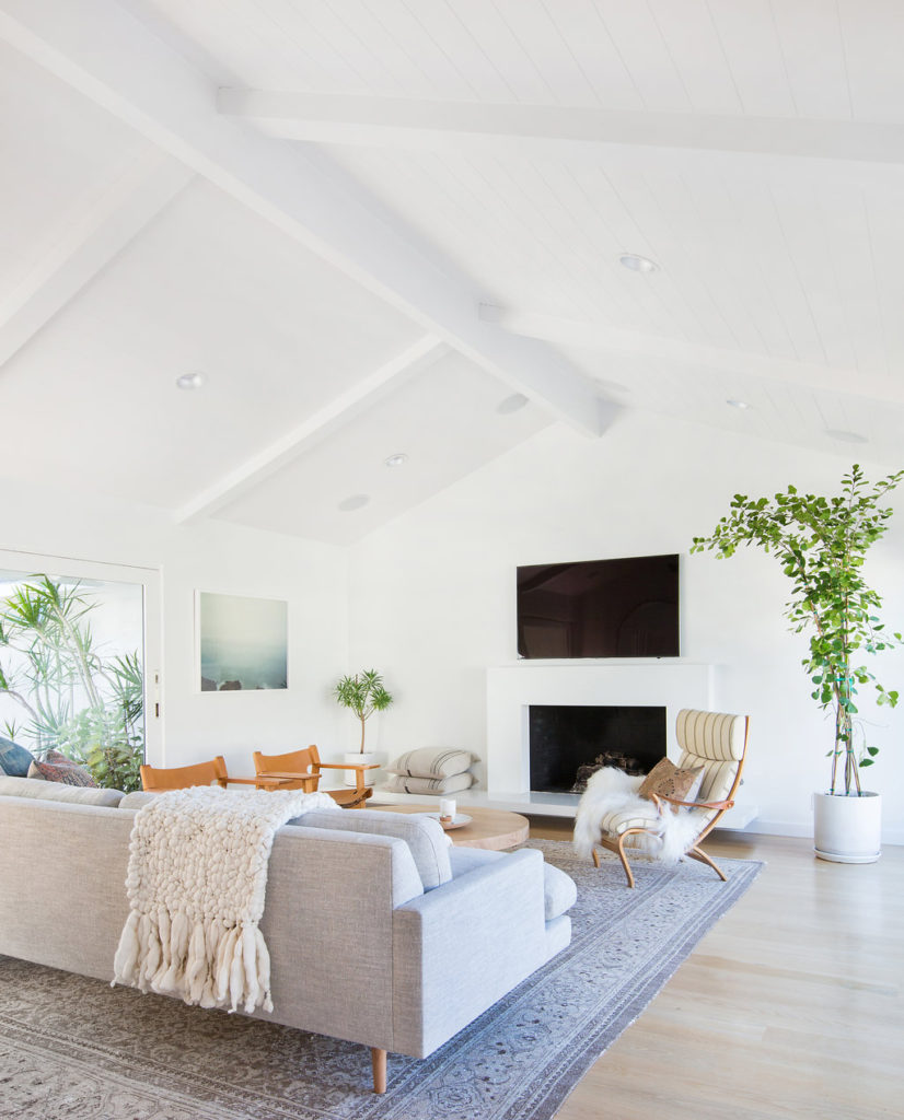
Rug Size
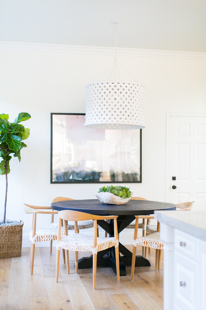
Almost every space I design has a rug. It’s the perfect way to ground a space, tie everything together and create a cozy vibe. I’ve talked about choosing the right rug before on the blog, but today I’m focusing on size, because the wrong sized rug can derail a room quicker than almost anything else. In a living area, ensure the rug is large enough to have at least the foot of all the furniture pieces on it. If possible try to leave at least 2 feet of space between the rug and the wall. If like me, you live in a smaller space, 12-18” from the wall is okay. In the dining room, make sure the legs of the chairs are on the rug when the chairs are pulled out.
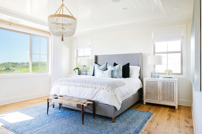
In a bedroom, I like to make sure there is at least 2 feet of exposed rug from under the sides of the bed. For a king or queen bed this means an 8×10 or 9×12. For a full size, a 5×8 is usually large enough.
Art
Art is a great way to add colour and interest to a space, but if it’s the wrong size or hung poorly is quickly cheapens the look. As a rule art should be hung at eye level (57-60″ from the ground to the center of the piece) so it can be easily and fully appreciated by everyone. It’s also important to ensure the piece is the proper scale, too small and it’ll throw the balance of the room off. If you absolutely love a small piece consider styling it on a bookshelf, side table or as part of a gallery wall.
Speaking of gallery walls, a trick to ensure you’re walls don’t start looking like Swiss cheese from nail holes is to trace and cut-out the frames outline on paper. Then simply tape the paper cut-outs onto your wall, trying out as many arrangements as you like until you find the one you love.
Painting First
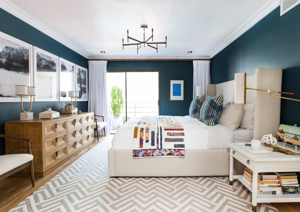
I know the feeling, you’ve found the absolutely perfect shade of blue for your bedroom and every part of you wants to run out and purchase the paint and start painting – resist the urge! Start with fabric and textiles first. It is much easier to match paint to a great fabric than it is to find fabrics (you love) to match the colour you’ve already put up on the walls. Save yourself and your wallet the stress by choosing your fabrics and textiles first.
Pushing Furniture up Against the Walls
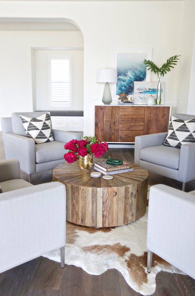
Resist the urge to have your furniture lining the perimeter of the room. While you might think it’ll keep the space feeling open and airy, in most cases it results in an awkward set up. Think about creating groupings that encourage conversation and comfortable lounging.
Lighting
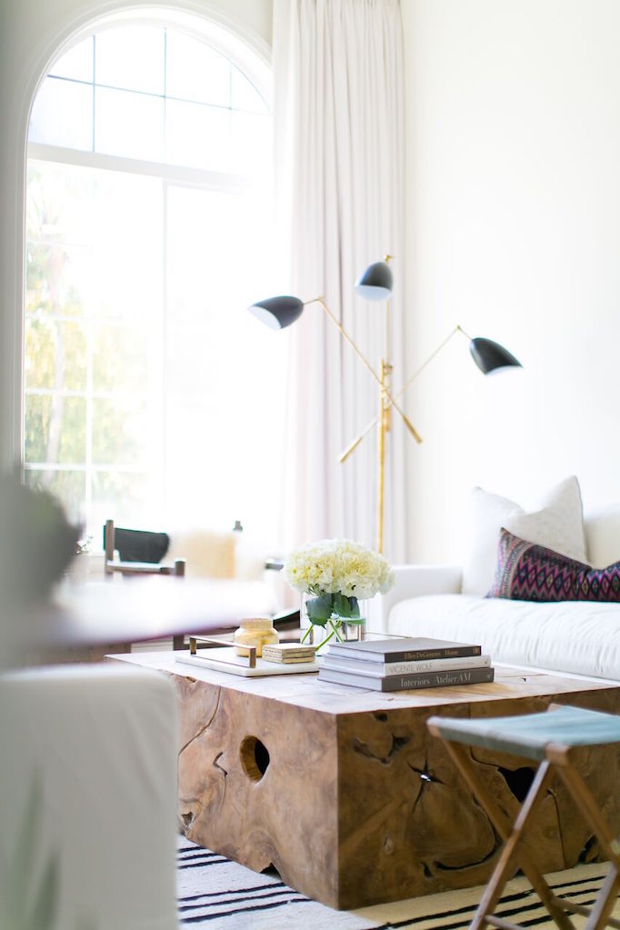
Lastly don’t solely rely on overhead pot-lights to light a room. Like everything else in a space, you want to layer your lighting. For example sconces around a fireplace or artwork, a floor lamp in a dark corner and a table lamp for reading.
A few simple tweaks can give your space the effortless beauty that a designer works to achieve. Any other problems areas in your home you’d like some additional tips for? Let me know, I’d love to help! And if you’re needing a little more focused help, click here to learn more about the packages I offer.
Images
No Comments
Sorry, the comment form is closed at this time.