Client Reveal: Bel-Aire Project
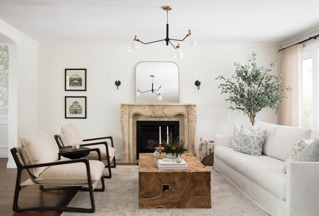
Sometimes open concept, isn’t quite the right concept. As was the case at our Bel-Aire Project. The previous owners had done what so many do when updating older homes – they opened it up. The result was a space that lacked function and intimacy.
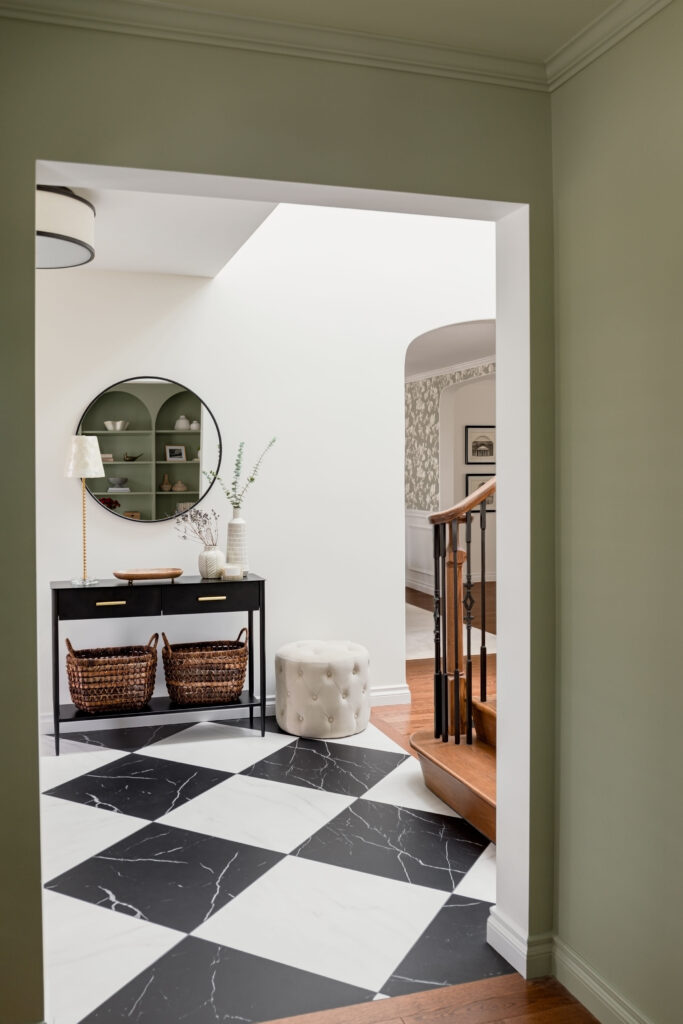
So when it came time to making their new home their own, my clients and I went back to basics. Closing things in and creating definition. Doing so allowed us to create a functional entry way. Timeless black and white marbled floor tiles and updated lighting set the tone for the home – a fresh take on classic design. Much more aligned with my young, bright clients.
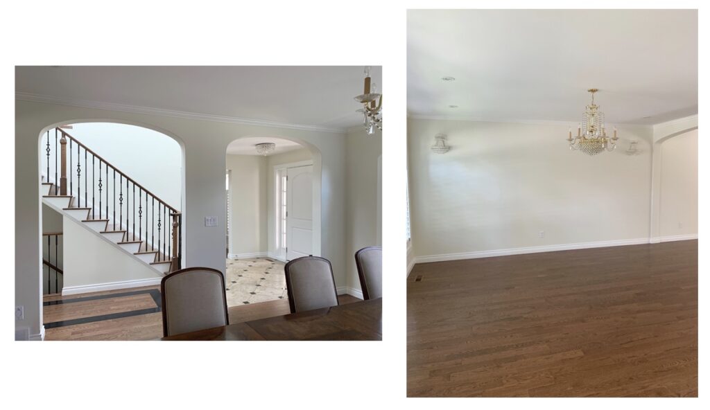
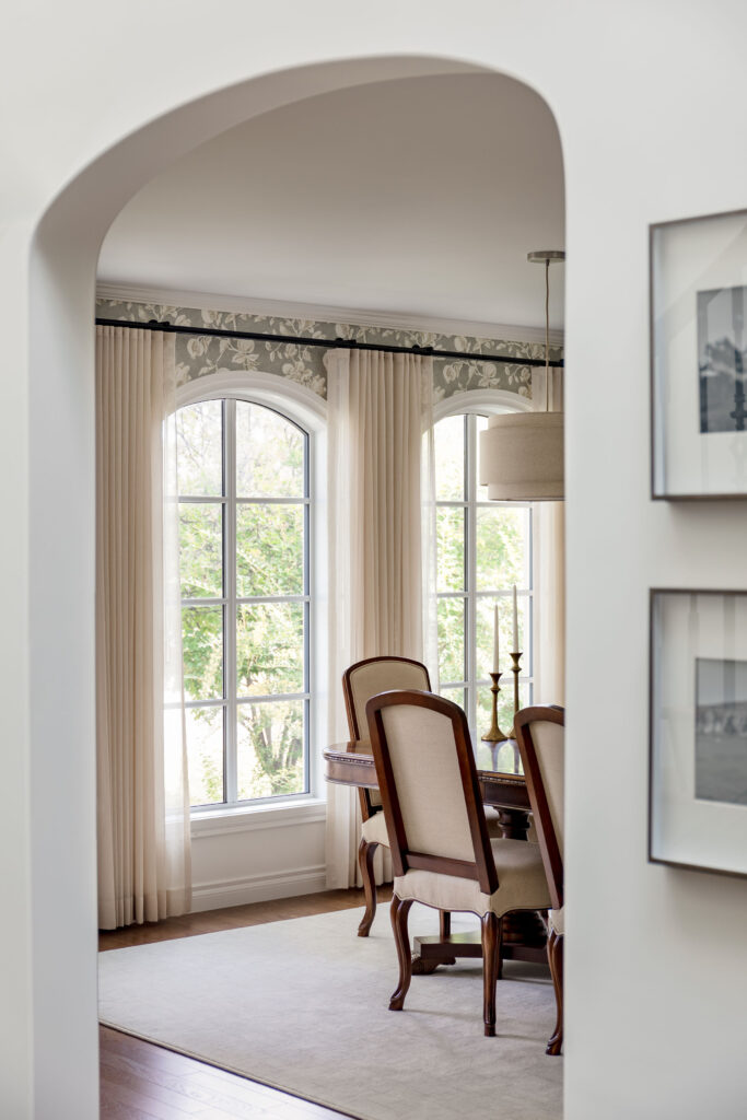
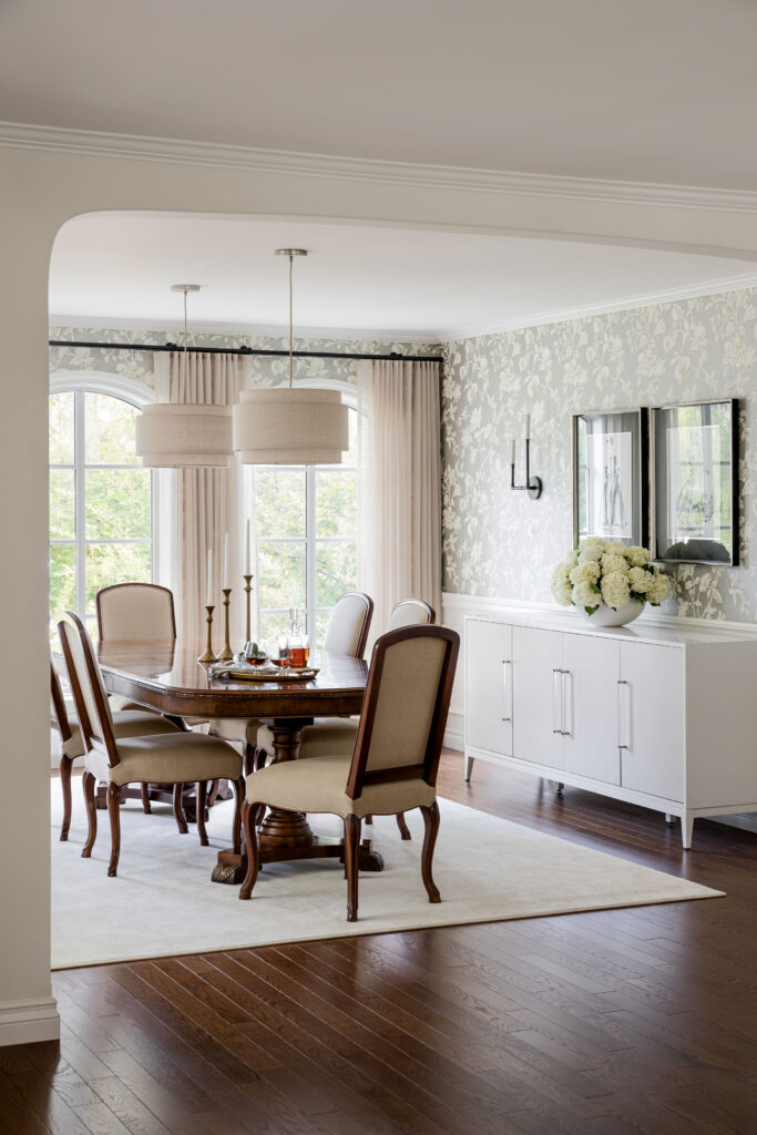
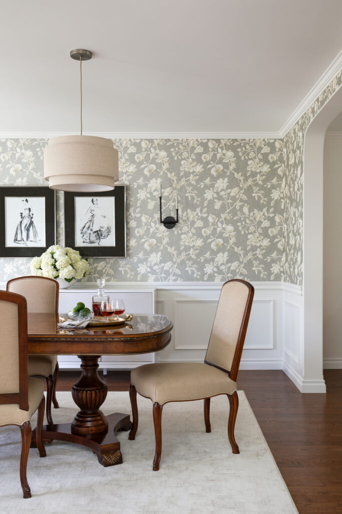
Narrowing the opening from the dining room to the living room allowed us to create two distinct spaces. We played to the traditional feel of the home in the dining room by adding a chair rail, panel moulding and wallpaper. The delicate, large-scale pattern of intertwining magnolias and pomegranates in a modern taupe and silver mix paired with my client’s gorgeous mahogany dining table, struck the perfect traditional, but not dated balance. Drapery, a simple sideboard, modern lighting, and unexpected art pull the space together in a fresh and timeless way.
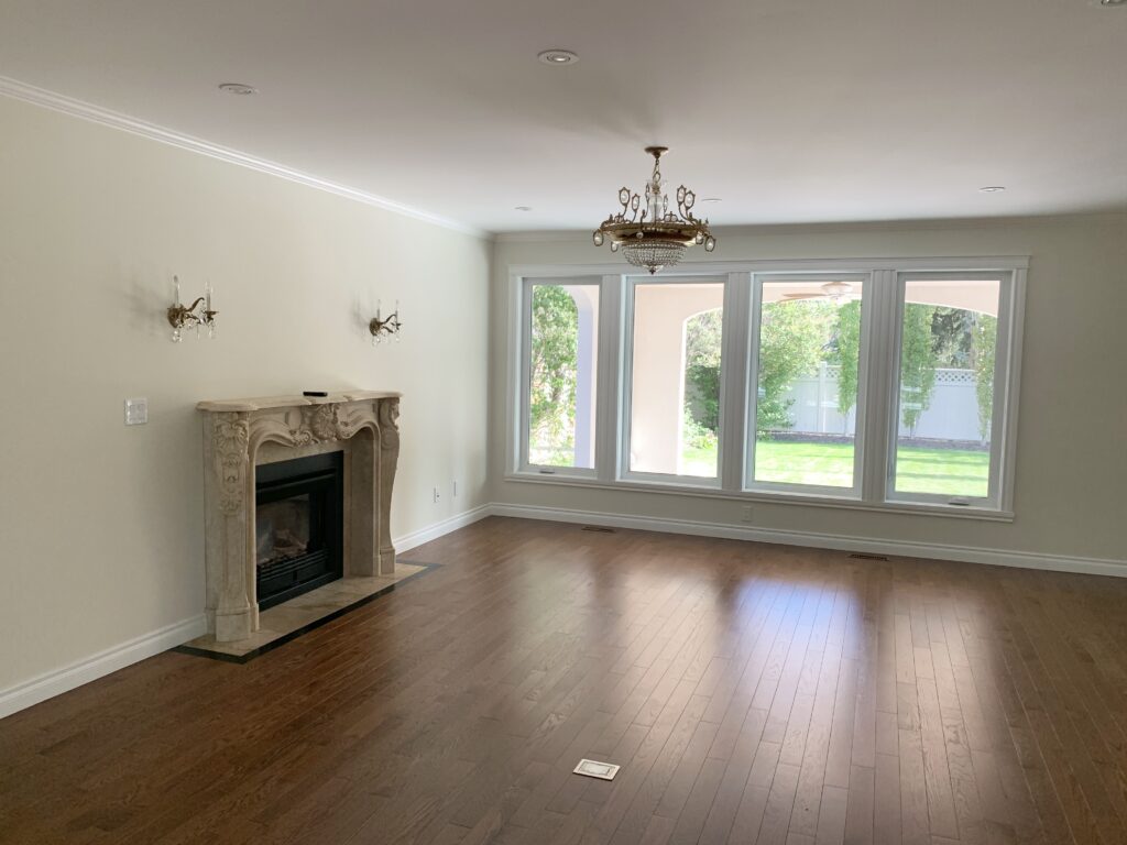
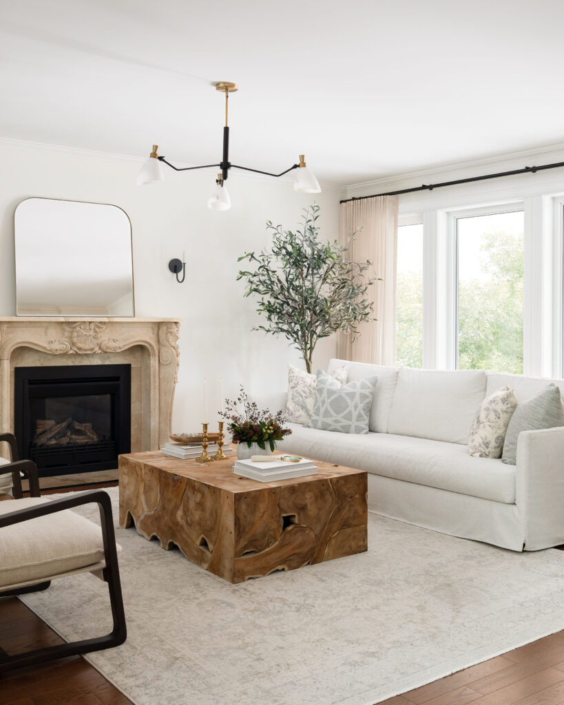
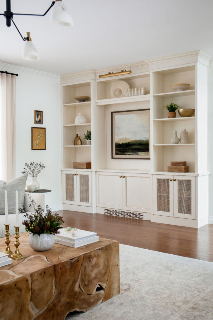
In the living room, we wanted the beautiful, ornate stone fireplace to be the focal point it was intended to be. With the original creamier wall colour, the fireplace felt lost and dull. Brightening up the walls with a warm white helped to draw out and highlight the impressive centerpiece.
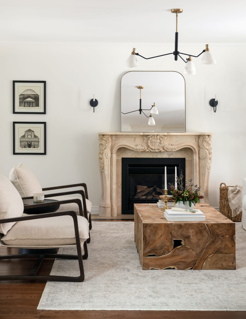
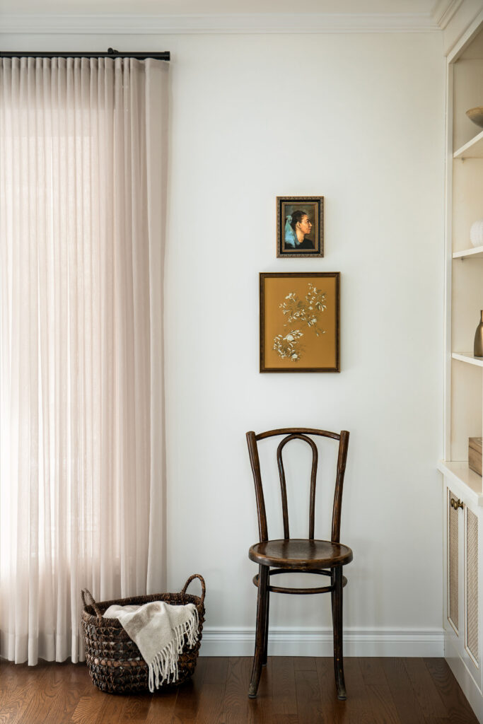
We kept the seating simple, with classic lines and comfort center of mind. The tone on tone area rug, plays to the traditional feel of the home, emulating the timeless style of Turkish hand-knotted rugs. Although the coffee table feels modern in style, the teak gives is a classic touch. I just love how it plays off the fireplace and helps to ground the space. Modern lighting and pretty textiles help to pull it all together.
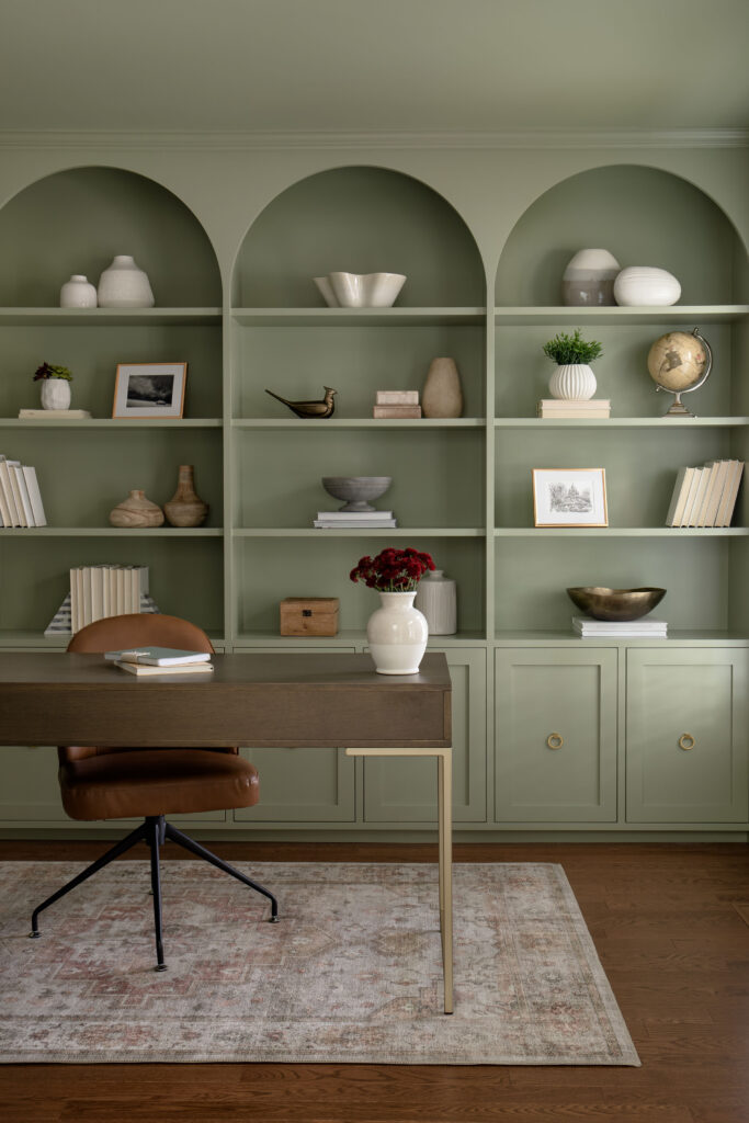
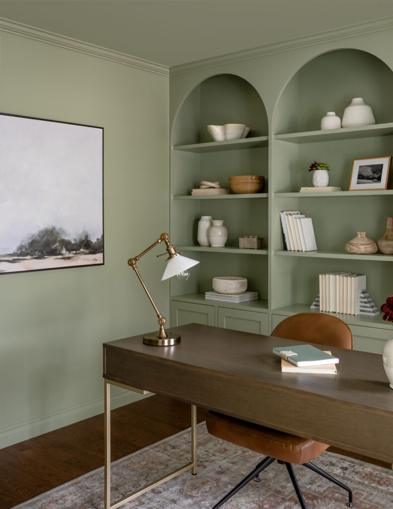
Last, but certainly not least we created a home office. This room was a blank slate and the perfect spot to add function while having some fun. We mimicked the arches throughout the home in the custom millwork and painted everything in a beautiful sage green. A colour that strikes that fresh yet timeless look we were after. Brass accents and an area rug with an old world feel make sure the space ties in with the rest of home.
Design: Neelam Interiors; Photography: Rebecca Frick Photography
No Comments
Sorry, the comment form is closed at this time.