Pantone Colour of the Year 2017
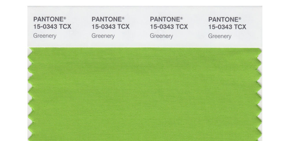
A few weeks ago Pantone announced it’s Colour of the Year for 2017, Greenery, to mixed reviews. What I love about the colour of the year announcement is the incredible thought that goes behind each year’s choice and how it opens us to consider colours we would have written off. I must admit when I first saw this year’s choice, I thought there was no way I could see myself incorporating it into a space, but as the colour has started to emerge in fashion and home decor, I have to say I’m warming up to it.
Greenery is a fresh and yellowy-green shade reminiscent of the first days of spring flourishing foliage and the great outdoors. It evokes feels of renewal, rejuvenation and revitalization. Greenery is considered natures neutral and it is thought the more hectic and busy our lives become, the more we earn for a connection to our natural world. It has big shoes to fill as it’s considered a life affirming shade and emblematic of the pursuit of personal passions and vitality. Leatrice Eiseman, Executive Director of the Pantone Colour Institute says ‘Greenery bursts forth in 2017 to provide us with the reassurance we yearn for amidst a tumultuous social and political environment. Satisfying our growing desired to rejuvenate and revitalize, Greenery symbolizes the re-connection we seek with nature, one another and a larger purpose.’
Greenery first debuted in the 1920s when women started making daring fashion choices, in fact Greenery appeared on the cover of a Vogue pattern book.
As the United States fell into recession in the 1930s, Greenery disappeared. It’s disappearance lasted into wartime in the 1940s when money for colour was spent on the war effort. But it re-emerged in a big way in the 1960s and after the publication of “Silent Spring” by Rachel Charleston in 1962, bright green was considered a ‘beacon of environmental friendliness’ into the ’70s.
If you’re into Numerology like me (if you’re not, this may be a little woo-woo, so feel free to skip this part ;-)), 2017 is considered a 1 universal year (2+0+1+7=10=1) and represents new beginnings and epic shifts, reminiscent of what Greenery is meant to represent. Crazy, right?! 🙂
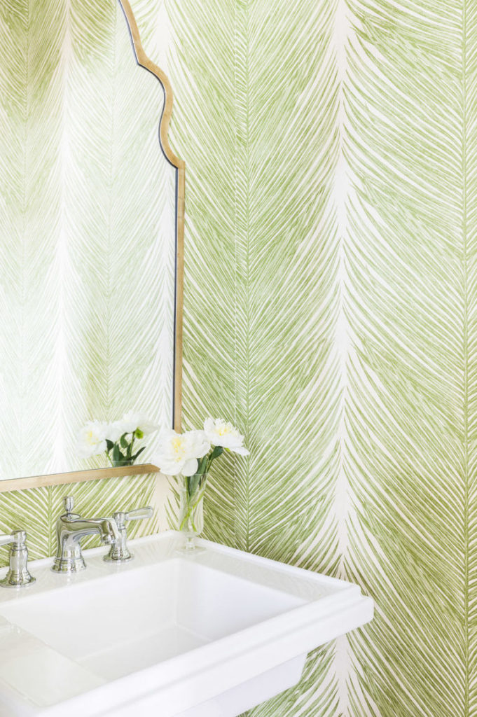
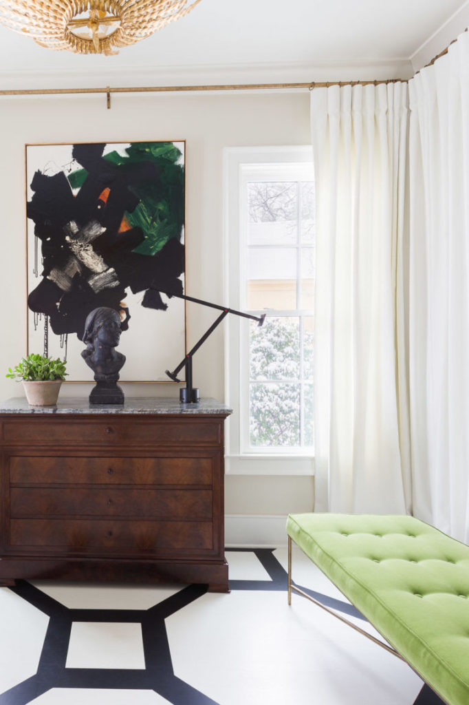
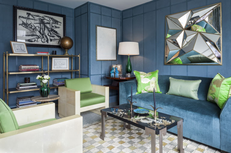
Despite all of the theory behind this years choice for colour of the year, you may still not be sure if this colour is for you. Not to worry, I’ve got some inspiration below that may just change your mind.
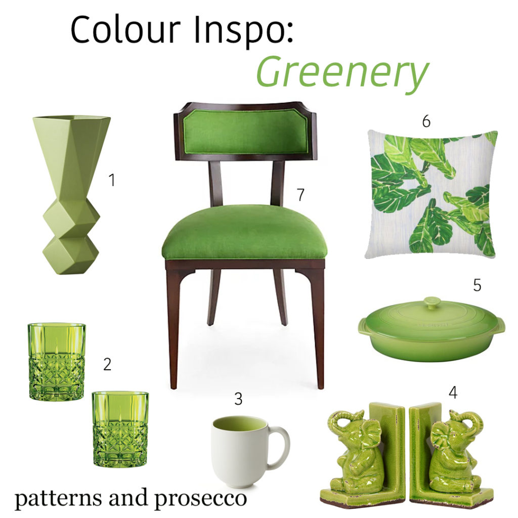
While an entire space in Greenery, would be overwhelming, I think this colour best used as an accent. I’ve pulled together some of my favorite ways to incorporate it into your decor below.
- Century Green Vase
- Highland Whiskey Tumblers
- Jars Tourron Green Mug
- Goodluck Elephant Book Ends
- Le Creuset Oval Stoneware Casserole
- Ferrick Mason Fiddle Leaf Fig Pillow
- Kate Spade Worthington Chair
Images
1 Alyssa Rosenheck Decorpad 2 Pantone Elle Decor 3 Alyssa Rosenheck Elle Decor 4 Marco Ricco Elle Decor
No Comments
Sorry, the comment form is closed at this time.